by Joshua Feb 20,2025
Unmasking "Angry Kirby": A Look at Nintendo's Western Marketing Strategy
This article delves into the reasons behind Kirby's contrasting image in the US versus its original Japanese counterpart, as revealed by former Nintendo employees. We'll explore Nintendo's global localization approach and its evolution over time.
A Tougher Kirby for Western Markets?
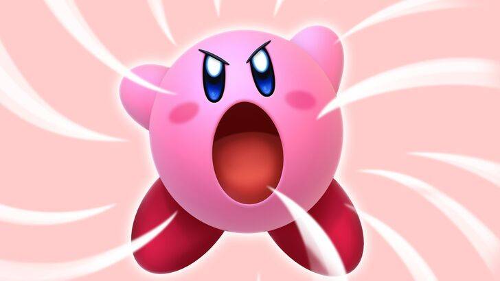
The "Angry Kirby" phenomenon—the perception of a more determined, even fierce, Kirby on Western game covers and artwork—wasn't about portraying anger, but projecting strength. Former Nintendo Localization Director Leslie Swan explained that while cute characters resonate universally in Japan, a tougher image was believed to better attract tween and teen boys in the US. This perspective was echoed by Kirby: Triple Deluxe Director Shinya Kumazaki, who noted that while cute Kirby drives Japanese appeal, a "strong, tough Kirby" resonated more in the West. However, he also acknowledged the success of cute Kirby, particularly in Japan, and that the approach varied by title.
Marketing Kirby as "Super Tuff Pink Puff"
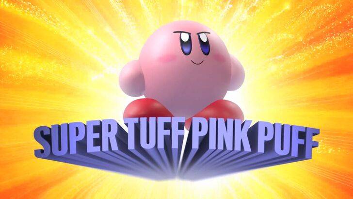
Nintendo's marketing strategies actively aimed to broaden Kirby's appeal, particularly among boys. The "Super Tuff Pink Puff" tagline for Kirby Super Star Ultra on the Nintendo DS in 2008 exemplifies this. Former Nintendo of America Public Relations Manager Krysta Yang highlighted Nintendo's desire to shed its "kiddie" image during that era, emphasizing the perceived negative impact of such a label on sales. This led to a conscious effort to showcase Kirby's combat abilities, moving beyond a solely "cute" persona. While recent marketing efforts have sought to present a more well-rounded Kirby, the "cute" image largely persists.
Localization Choices: From Ghostly White to Determined Expressions
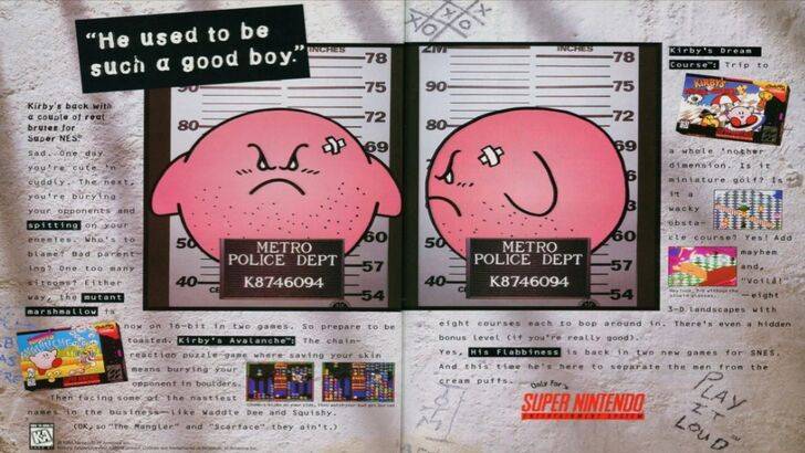
The divergence in Kirby's localization began early. A 1995 "Play It Loud" ad featuring a mugshot-style Kirby is a prime example. Subsequent years saw variations in Kirby's facial expressions on game box art, with titles like Kirby: Nightmare in Dream Land, Kirby Air Ride, and Kirby: Squeak Squad showcasing sharper eyebrows and more intense expressions. Even Kirby's color was altered; the original Game Boy Kirby's Dreamland featured a ghostly-white Kirby in the US, a decision attributed to the Game Boy's monochrome display and the belief that a pink character wouldn't appeal to the target demographic. This early experience shaped subsequent decisions to adjust Kirby's appearance for Western markets. In recent years, a more consistent global approach has emerged, though Kirby's image still fluctuates between serious and playful.
A Shift Towards Global Consistency
Swan and Yang agree that Nintendo has adopted a more globalized approach, fostering closer collaboration between its Japanese and American offices for more consistent marketing and localization. This shift aims to reduce regional variations and avoid past miscalculations. While Yang acknowledges the benefits of global consistency for brand recognition, she also notes the potential for a homogenized, less regionally nuanced approach. The current trend toward global consistency is partly attributed to the industry's globalization and the increasing familiarity of Western audiences with Japanese pop culture.
Forsaken Characters Ranked: Tier List Update 2025
How to Use Cheats in Balatro (Debug Menu Guide)
State of Play Reveals Exciting Updates: PlayStation February 2025 Showcase
Infinity Nikki – All Working Redeem Codes January 2025
Roblox: Obtain Secret Codes for January 2025 (Updated)
Pokémon GO Raids in January 2025
LEGO Ninjago Sets Top the Charts (2025)
Wuthering Waves: Redeem Codes for January 2025 Released!
Silent Hill f Trailer Introduces Hinako, Voiced by Suzie Yeung
May 01,2026
Kaiju No. 8 Game Adds New Original Character
May 01,2026
Dying Light: Beast Dev Says Open World Size Not Key
Apr 29,2026
Hideo Kojima Reveals First Look at Death Stranding Animated Film Mosquito
Apr 29,2026
Covenant: Learn the Core Game Mechanics
Apr 28,2026
 Category